Power BI - What can go wrong?
Data is ultimately any organisation’s asset if it is transformed into information that facilitates actionable insights. Microsoft Power BI does just that, it helps to connect disparate data sets, transform and clean data into a data model and create charts or graphs to provide visuals of the data. So it’s an incredibly impressive platform packed with so much power and capabilities, however with this comes user error and common mistakes.
Perform a web or YouTube search and you will find many articles and videos that discuss mistakes made using Power BI. They cover a broad range of topics; unsurprising, since anything can go wrong between the initial connection to data; through data shaping and transformation, modelling, and calculations; to report design, final publishing and collaboration between colleagues. And that’s just for a single report. Take it up a level and we can find problems with how teams re-use data (or not) across multiple reports and, at a higher level again, strategic problems and mistakes made when deploying Power BI across an organisation.
In this blog, I have selected ten common mistakes across different areas and levels of detail. There are three mistakes discussed at the deployment level, three in report design, two on data modelling and two on data transformation. Whatever your interest is in Power BI, hopefully there are some that resonate and provoke some thoughts.
Mistakes made at the deployment level
1. Under-estimating effort required to build capability
Developing capability in Power BI is not easy or quick. Yes, you may run some successful proof-of-concept projects, perhaps with external help. But, sustained self-sufficiency across the organisation requires strategy, rigour, and discipline. Content consumers represent the biggest group of users; but even to view, interrogate and collaborate on reports requires training. Perhaps the biggest sin here, though, is assuming that all content creators can be labelled with the same badge. It’s a broad topic, to the extent that some experts focus their careers on just one element, such as mastering DAX (Data Analysis eXpression language). For an organisation to think they can send staff on a two-day “content-creation” course and return as masters of Power BI is fanciful. Then there’s the admin side of Power BI, a subject so broad it is often split across multiple roles.
Recommendation
Be realistic with expectations from training and accept that capability will grow incrementally through experience. Identify your champions of Power BI, those who demonstrate success from Power BI, and promote it internally and provide incentives to keep good people motivated. Recognise the support infrastructure that you will need to develop capability. This should include a Centre of Excellence (COE) to oversee training and mentoring, a community of practice for knowledge sharing, and a helpdesk for users to log support tickets when they can’t find an answer elsewhere.
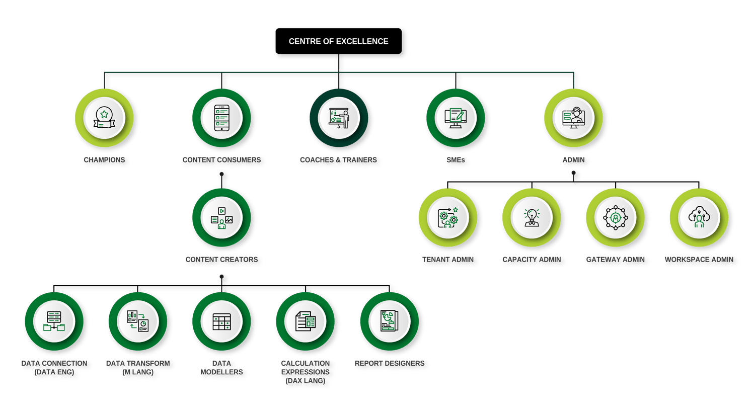
There's a considerable Power BI infrastructure that poses a variety of learning and capability needs.
2. Lack of strategy and deployment plan
This ties in closely with #1 above. There are many considerations for any organisation deploying Power BI, or there at least should be. Strategically, the executive team should have a clear plan for data ownership – its either decentralised to business units or centralised to an IT or a BI team – and with report ownership, whether this is decentralised or centralised. Hybrid models also exist, such as a “Managed” service, where data is owned centrally but reports owned in the business. The strategy will vary between organisations and the industry they operate in, but should be defined up-front. Such clarity is often lacking, coupled with a “lets see how this thing develops” attitude. Clarity on content ownership drives decisions on governance, where decentralised ownership usually means less stringent governance and more flexibility. Again, this is an area where organisations often do not plan for appropriately, causing the deployment to meander with no real focus and direction. There may be pockets of good practice developing but it’s not broadly embedded.
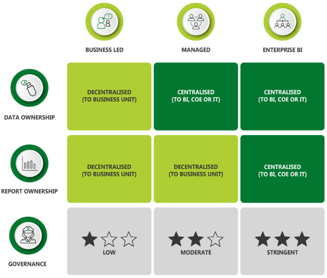
Recommendation
Microsoft provides extensive documentation on an adoption roadmap for organisations (Power BI adoption roadmap - Power BI | Microsoft Learn). It’s a comprehensive approach covering ten important areas that needs planning. Each area has five levels of maturity, so you can assess where you currently are, set future targets, and put action plans in place to close gaps. At Reinvigoration, we align closely to Microsoft’s roadmap – it makes sense to take advice straight from the product developers.
3. Duplication of data across workspaces, dataflows and datasets

Organisations that don’t have a strong data culture suffer from a lack of trust in data sources used by different departments. A consequence of this is that there are usually multiple sources of the same data. Traditionally, this manifested in teams and departments managing their own local Excel spreadsheets containing the same data. Not only is this duplication of effort, it exacerbates a lack of trust between teams and requires additional effort to reconcile differences. In Power BI deployments, instead of Excel spreadsheets the data is duplicated across multiple team workspaces, their dataflows within their workspaces, and their datasets (data models) that support the Power BI reports. Who really knows which version is current?
Recommendation
It’s a simple concept – one dataset, one owner, one single source of truth – but one that organisations find difficult to enforce. Perhaps this is because much effort is focused on content creation but not enough on data ownership and governance. Create a data catalogue with clear ownership for every data item used. From the outset, as part of the administration tasks, carry out frequent audits to check for duplicated data across workspaces. Set up and document organisation-wide dataflows so that everyone knows where to access a specific piece of data. That means specific data only needs to be maintained in one place, improving accuracy, building trust and reducing the effort to maintain and update it.
Mistakes made when creating Power BI reports
4. Assuming you know what the user wants or needs
This concept should be familiar to any of us who need to give a presentation, write a report, design, or improve an existing process. Too often we assume what the audience, users, or customers want from us. Maybe due to time pressures, or the desire to make progress, report creators are almost always too quick to launch Power BI Desktop and start putting visuals on the page. It’s difficult for a report designer to turn back once this point is crossed. But often content or functionality that is useful to the report consumer is missed, leaving too much rework to incorporate it post-build. Related to this problem is the report creator putting their convenience before the end user’s needs. It may take two hours to design the easy option, but six hours to provide what the customer really needs (and the creator may have a backlog of other reports to move on to). The result is a report that only partially fulfils the consumers’ needs, leading to dissatisfaction and a belief that Power BI is lacking in capability.
Recommendation
The technique of the “Voice of the Customer” that we use in process or product design applies equally in the design of a Power BI report or dashboard. It is important to invest the time up front, typically around 25 percent of the total design and development effort, with your end users to create a clear picture of how the final report will look and how they will navigate through it. With a representative sample of prospective users, workshop the answers to the following questions:
- Who is the audience?
- What insights are they looking for; snapshots, trends, volumes, relationships?
- Which parameters are they interested in; over what timescales?
- How will they use the information in the dashboard; to increase knowledge, understand why performance is this way, understand what went wrong, to make predictions, to identify the most important factors?
- How do they want to interact with the report? Website or mobile?
- What options are available for the user to interact with the dashboard?
For larger projects, create a PowerPoint mock-up which replicates how you intend the final report to look – theme and fonts, visuals, buttons, icons. This helps in two ways. First, there are no unwanted surprises for your users when you publish; second, it guides your design process. It’s much easier to design with an end state in mind.
5. Ignoring Accessibility
Legislation was introduced in September 2019 requiring all UK public sector websites to meet accessibility standards WCAG 2.1 (level AA) (Web Content Accessibility Guidelines (WCAG) 2.1 (w3.org)). This includes Power BI reports published online. However, according to the UK government, at least one in five people in the UK have a long-term illness, impairment or disability (Understanding accessibility requirements for public sector bodies - GOV.UK (www.gov.uk)). Therefore, it makes sense for all organisations to design Power BI reports for accessibility. This is not done routinely by report designers and requires much rework to retro-fit accessibility into their reports. Seemingly simple issues such as fonts too-small can pose major headaches in bringing them up to accessibility standards (for cases where visuals may need to be re-designed and the number of visuals on each page reduced, which could impact user navigation).
Recommendation
Design your reports for accessibility by default. It is much easier to configure accessibility features during the build phase than afterwards, and it encourages good design practices. Microsoft has developed Power BI to meet the latest accessibility standards. This means there are built-in features, including keyboard navigation, screen reader compatibility, high contrast view, focus mode (used to expand a visual), and show data table (screen reader friendly). However, there are some features that the report designer needs to configure. These include alt text for each visual (for screen readers); setting a meaningful tab order for visuals (for keyboard users); good contrast between text and background; a sans serif font, such as Arial, with minimum 12pt font; and colourblind-friendly colours in the theme. There are other considerations too, but you can be guided through the process with Microsoft’s comprehensive documentation (Overview of accessibility in Power BI - Power BI | Microsoft Learn). Throughout the build, test your report for:
- Keyboard navigation and use of keyboard shortcuts
- Contrast ratio of at least 4.5:1 for text and background, using a tool such as Color Contrast Checker - TPGi
- Test for colour deficiencies (using tools like Coblis — Color Blindness Simulator – Colblindor (color-blindness.com))
- Use of screen readers, with tools like NV Access
6. Reliance on implicit measures
For new report creators in Power BI Desktop, relying on the Implicit Measures that are built into visuals can be a good way to get started. But they are only suitable for the most basic reports, since the range is limited to a handful of calculation options. However, too many report designers stick with this approach, avoiding the use of Explicit Measures in DAX through fear or ignorance. Then when they take on more functionality, errors in the numbers arise. This in turn creates mistrust among the report consumers, trust that is difficult to regain.
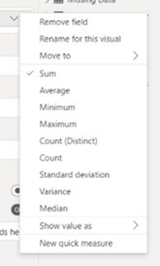 Consider the scenario where a business operates through multiple stores. Store A has annual sales of £100k with a profit of £20k, so a profit margin of 20 percent. Store B, a larger store has annual sales of £300k with a profit of £90k, so a profit margin of 30 percent. The report creator wants to offer users a slicer to select multiple stores and provide the consolidated % profit margin. A common mistake made is to use the “Average” Implicit Measure. But that would compute the average of 20 percent and 30 percent i.e. 25 percent. The true value should be £110k / £400k = 27.5 percent. This is a common problem when dealing with “non-additive” measures such as percentages and ratios.
Implicit Measures are restricted in their options
Recommendation
Encourage report creators to avoid the use of Implicit Measures. Creating the DAX calculations for the above, to get the correct value of 27.5 percent, is quite simple for anyone who has used formulas in Excel. Therefore, promote the use of Explicit Measures with DAX as best practice. It is important to recognise that everyone has their limits when it comes to creating calculations in DAX, so find out who your DAX super-users are and call on them as internal experts for the more challenging scenarios.
Mistakes made in the data model
7. Poor model structure
One of the advantages of Power BI is speed to mobilise. Since Power BI Desktop can be downloaded for free, anyone can start creating reports quickly. But that is also a weakness. First time users of Power BI Desktop may be excited by the flexibility of pulling data from multiple sources, unaware that by default, Power BI looks for and creates relationships between the different data tables. Power BI is creating a data model in the background and the relationships in the model induce filtering paths that determine the output values in the report, known as filter context. The user may be completely unaware of best practice around data model design, and yet is allowed to create a report upon which business decisions are made. “Incorrect values” may be reported, information this is not actually incorrect but misunderstood. As more data sources are added, the relationships may become more complex and convoluted, making it difficult to understand and trace why expected values are not being computed.
Recommendation
Do not release Power BI Desktop to new users without giving them a basic understanding of how to use it end-to-end, and especially guidance on model design. Microsoft excels in online learning for free. They offer a collection called “Become a Power BI data analyst”( Collections - MicrosoftPowerPlatform-5978 | Microsoft Learn), about two-days of full-time study that covers all the basics through six “learning paths”
- Get started with Microsoft data analytics
- Prepare data for analysis
- Model data in Power BI
- Visualise data in Power BI
- Data analysis in Power BI
- Manage workspaces and datasets in Power BI
The learning path “Model data in Power BI” is particularly important to develop an understanding of the star schema used in dimensional model design. From this base knowledge, there are more advanced options that users can pursue to improve their modelling skills.
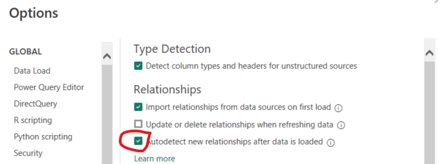
Encourage your report creators to switch off the default setting Within Power BI Desktop that autodetects new relationships after loading new data, by unchecking the box in Options & Settings > Options > Data Load (CURRENT FILE).
Doing this forces the report creators to think about what they need from their data model and how to structure it. They should create models that follow the best practice “star schema”, with clear distinctions between “facts” and “dimensions”.
Example of a star schema, best practice model design in Power BI (e.g., a supermarket chain)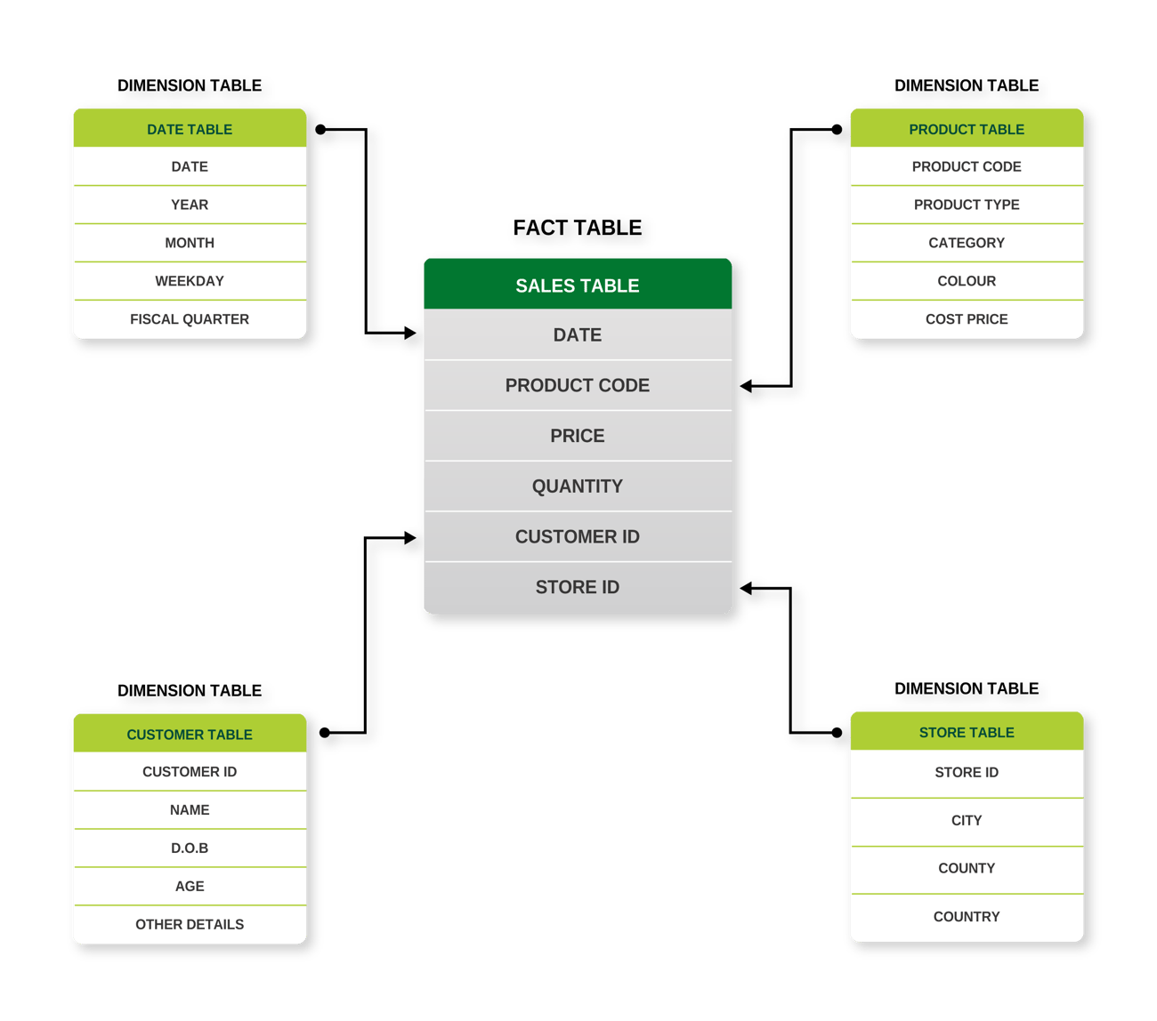
8. No date table in the model
Date tables are counter-intuitive. The applications we use recognise time and date data, so we can happily create a dated list of events in Excel and a graph to plot them over time, even though there are gaps in the dates. The same is true in Power BI; we could create a graph, with date on the x-axis, and it wouldn’t matter if some dates didn’t exist in the data. Furthermore, we could use the auto date/time option in Power BI to perform time intelligence in DAX on the same data. It’s not surprising then that new users are unaware of the need for a date table.
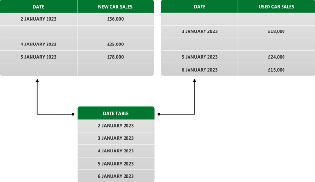
Problems arise when you have 2 or more time series graphs on the same Power BI report page, from 2 sets of date-stamped data, and you want to filter the time span simultaneously on both graphs, as in a date slicer. You cannot do it unless they contain the same dates and have a relationship set up between the tables in the model. This is not usually the case; you need a bridge between the tables that a date table can provide, because it has no gaps in dates. Not having a date table severely restricts the navigation options for the end user.
Recommendation
Encourage use of a date table in every model as best practice. There are some conditions that need to be fulfilled (see Create date tables in Power BI Desktop - Power BI | Microsoft Learn) but they are easy to set up. Users can create one as a calculated table in DAX (often the easiest option, unless the dataset is very large and could cause performance issues); or create in Power Query (to reduce the model size), or better still use a date table that exists in your source database and import it through Power Query. The benefit of this last approach is consistency in the content of the date table for all Power BI users across the organisation. One simple act that would increase efficiency for content creators is to mandate a single organisation-wide date table for all Power BI users.
Mistakes made in data shaping and transformation (Power Query)
9. Hard coding of data in Power Query
It is tempting for a report creator to update Power Query by hand with missing or incorrect data. After all, it’s a quick fix that will allow the report to be published. The problem with doing that is, future data refreshes could lead to incorrect or obsolete data in the model. For example, company “Alpha” may be listed in different sources as “Alpha”, “Alpha Services”, “Alpha Limited”, “Alpha Services Limited”. It is a mistake for the report creator to overwrite different spellings within Power Query as the changes would be hard-coded, local, and not dynamic. This could pose problems in future should “Alpha” change its name or merge with another company. It’s also very difficult for new owners of such a report to debug problems; they would not know where the data has been overwritten, and it would be time-consuming to trace through Power Query. People sometimes leave an organisation, taking with them the knowledge of little tricks and workarounds they built into their data model.
Recommendation
Encourage content creators to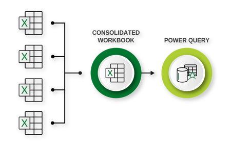 avoid any kind of hard-coding in Power Query. Use audits to check for it – an auditor with knowledge of Power Query will know what to look for – and advise the content creator on the risks it poses. Even for times you think a small dimension table to convert, say, acronyms into company names would not cause any harm, but, having this table in Power Query alone reduces its visibility. It’s better to maintain tables like this externally, using Excel. For any data that needs to be maintained and loaded from Excel, a consolidated file that is used to pull together all Excel information which then loads it into Power Query, will provide better visibility of the data that is being pushed to the model.
10. Assuming Excel matrix data models are fit for Power Query
Excel tables, as we are used to seeing them, are bad for Power Query. The matrix format that we find insightful looks something like below:

This matrix format is ideal for using in Excel, where individual cells can carry different formats. Therefore, the sales cells can be formatted as currency, with the years formatted as integers. This makes for easy display and producing charts in Excel. However, Power BI needs data in columnar format. Each column needs to represent a single field, formatted in one single way.
Power BI needs the data in a format such as below:

What often happens in this situation is the report creator will use Power Query to transform the data from matrix format to columnar format. This involves a lot of transformation steps, each one representing an opportunity for an error in the future. If the underlying spreadsheet structure changes in any way (even something simple like removing the blank line above Total Sales) then an error will occur, and the Query will do one of two things.
If you’re lucky the query will break and Power BI will highlight that. You would not be able to proceed unless you fix it, but you will have visibility of the problem. If you’re unlucky, then the query will pass through with errors that you did not notice. Your visuals in the report could show incorrect sales totals. Any consumers of the report will mistrust the whole report and its creator.
Recommendation
Consider every single transformation step in Power Query as an opportunity for something to go wrong at a future data refresh. In the same way that process complexity increases the potential for failure at some process step, complexity in Power Query transformation steps increases the possibility of future errors creeping in. It makes sense then to feed your data into Power Query in a columnar format as much as possible to minimise the transformations required. Relational databases and their SQL queries will do this anyway. But if you are working with Excel data in a matrix format, then first make it columnar within Excel, using Excel indexing formulas. Have two sheets, one with your matrix format and a second sheet in columnar format. Feed this second sheet into Power Query. It is so much easier to then see any problems in the data in Excel, before you load the new data and refresh the Power BI report.
