Core tools drive success in operational excellence
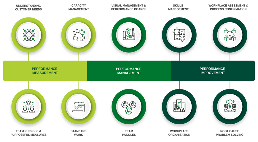
We have supported over 150 global organisations in more than 50 countries in their deployment of Operational Excellence. Our success comes down to 10 tried-and-trusted core tools that drive at least 10-15 percent efficiency improvements soon after adoption:

The three aspects that permeate Operational Excellence are:
-
Performance Measurement
- Performance Management
- Performance Improvement
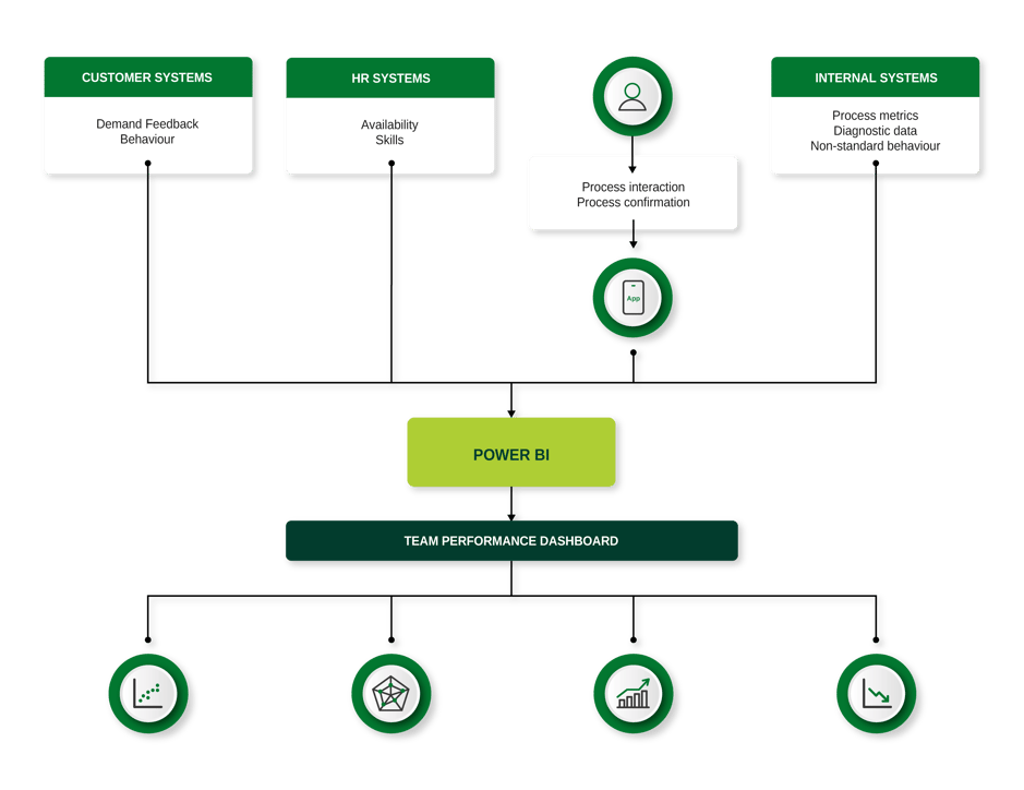
Performance measurement involves collecting data. These include data on customer needs, customer demand and behaviour, internal process performance and diagnostics, and team data covering team capacity (availability) and skills capabilities.
Operational excellence is data-intensive
Therein lies the problem (or it did). Effective decision making requires data, usually lots of it. You cannot effectively manage the performance of your processes and teams without data. However, the traditional approach was manual and labour-intensive.
For example, when a team wanted to perform a demand vs capacity analysis, they would need to collect and analyse data from multiple systems. The traditional approach would be for a team member to extract data from each system, copy and paste into an Excel spreadsheet (or worse, re-type it in), then create formulas in Excel to perform the analysis. Perhaps the graphs or output tables would then be copied and pasted into PowerPoint, slides printed, and then pinned to a team performance board, in time for the next team huddle (usually the following day). That was just one area of data collection required for operational excellence; more data is needed to produce team performance KPIs, monitor process behaviour, perform root cause problem solving and oversee team skills and capability.
You could understand why, despite the benefits, teams developed data-fatigue and pushed back on manual data processing and analysis. Plus, the effort involved negated some of the efficiency gains. So, there was always a compromise between the value obtained from the data and the effort to process and analyse it.
Automation of data management and visualisation
The emergence and rapid development of data management and visualisation suites, such as Microsoft Power Platform, coupled with secure cloud storage capability has transformed data collection, processing, and analysis. What was previously done manually can be automated, allowing the team to focus on interpretation of the data and making the right decisions. Legacy systems can be integrated through workflow tools such as Power Automate. Workers can interact with their processes through Power Apps and all the necessary data can be consolidated into a data warehouse data model, processed, analysed, and visualised through Power BI. Teams can collaborate through the Power BI service, or through integration with Microsoft Teams. Automated alerts can be set up when KPIs exceed thresholds, all through the same platform.

Conclusion
Developments in process automation and data visualisation applications over the past decade has transformed the way we can deploy operational excellence. The principles of operational excellence and our core 10 tools still apply. However, teams can now focus on specifying their data analysis needs to support operational excellence and implement an automated solution, rather than repeated manual collection and processing of data. This drives adoption of good habits and highlights additional opportunities for automation. The automation of data visualisation also facilitates remote working and collaboration. Furthermore, as artificial intelligence capabilities in such applications continues to grow, decision-making will become more powerful and drive further improvements in team performance.
